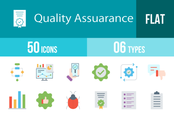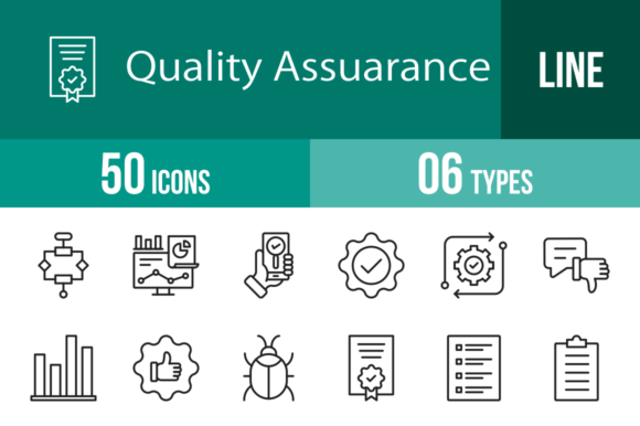
50 Quality Assurance Filled Line Icons for Modern Design
When you're building a brand, crafting a presentation, or designing a mobile app, the small details often carry the most weight. Icons, for instance, silently communicate volumes about a product's reliability, professionalism, and user-friendliness. This is exactly where a set of 50 Quality Assurance Filled Line Icons becomes an indispensable part of your design toolkit. More than just decorative elements, they are visual shorthand for trust, precision, and functionality—concepts that matter deeply in today's digital and print landscapes.
Visual Style and Practical Appeal
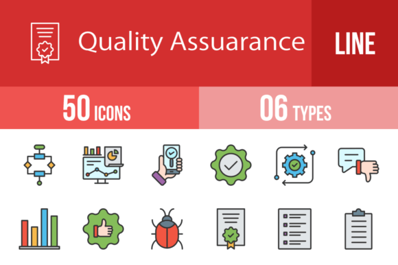
These icons are built on a unigrid system, which means they share consistent proportions, stroke weights, and visual rhythm. The filled line style strikes a balance between boldness and clarity, making them versatile enough for both detailed interfaces and large-scale prints. Each icon—from Algorithm to Website—has been crafted for maximum usability, ensuring they remain legible at various sizes. Because they are 100% vector, you can scale them to fit a business card or a billboard without losing sharpness. The included formats (AI, CDR, EPS, JPG, PNG, SVG) cover nearly every design scenario, and with 20 PNG sizes, you have flexibility for web, mobile, and print right out of the box.
What sets this collection apart is its focused theme. Icons like Bug Problem, Troubleshooting, Approved, and Rejected speak directly to processes around quality control, testing, and improvement. They carry a personality that is professional yet approachable—clean lines with a subtle weight that conveys stability. Whether you're a developer showcasing app features or a marketer illustrating a process flow, these icons blend seamlessly into diverse visual languages without overwhelming your layout.
Where These Icons Shine Most
Think about the last time you used an app and felt confident in its performance. Chances are, clear icons played a role in that experience. For mobile apps and websites, icons like Settings, Performance, and Update help users navigate features intuitively. In presentation design, using icons such as Analytics, Bar Graph, and Checklist can transform dense data into digestible visuals. For print materials—brochures, manuals, or packaging—icons like Certification, Guarantee, and Trust reinforce credibility at a glance.
This set also works well in editorial design and social media graphics. Imagine a blog post about software development enhanced with Scripts, Integration, and Functional icons. Or a social media carousel breaking down the steps of App Testing using Tester, Execution, and End To End visuals. For small business owners, incorporating icons like Customer, Satisfaction, and Service into invoices, feedback forms, or service menus adds a layer of professionalism that builds brand identity. Even hobbyists and crafters can use them in personal projects—think custom planners, educational materials, or DIY labels.
Making the Most of Your Design Assets
Choosing the right icons is less about following trends and more about aligning with your project's goals. Start by auditing your content: what messages need visual support? If you're designing a QA dashboard, icons like QC, Routine, and Improvement will be your go-to. For a customer feedback portal, Survey, Questionnaire, and Bad Review can guide user interactions. Always test icons in context—place them alongside your typography, color palette, and other design assets to ensure harmony. Since these icons are vector-based, you can easily adjust colors or simplify details to match your brand identity.
Pairing these icons with the right typeface enhances their impact. A clean sans serif font complements the modern, technical feel of icons like Software and Cogwheel. If your project leans more toward editorial or luxury branding, consider a serif font to add contrast and elegance. For a more casual or creative vibe, a handwritten font or script font could work, but use them sparingly to maintain readability. The key is balance—let the icons support your message without competing with your text.
Finally, remember that consistency is crucial. Using the same icon style across your web design, packaging design, and logo design materials creates a cohesive visual language that strengthens recognition. With 50 icons covering a wide range of QA-related concepts, you have enough variety to address different contexts while maintaining a unified look. Whether you're a designer building a premium font showcase, a startup creating a commercial font for client projects, or a content creator enhancing your blog, these icons offer practical value that goes beyond aesthetics.
In the end, good design is about solving problems—and the right icons can solve visual communication challenges efficiently. This set of 50 Quality Assurance Filled Line Icons does exactly that, providing a reliable, versatile, and professionally crafted resource for anyone who values clarity and quality in their work.