Strategic Visuals: Integrating 50 Strategy Icons into Your Workflow
Beyond Clip Art: The Anatomy of Strategic Design Assets
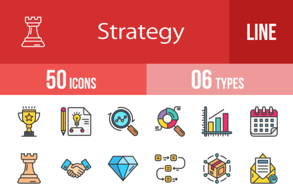
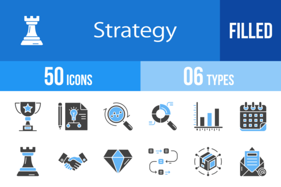
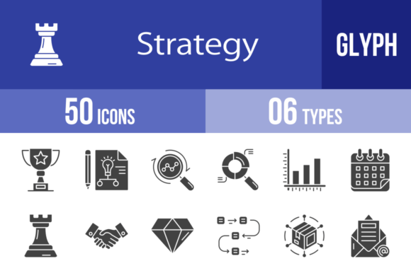
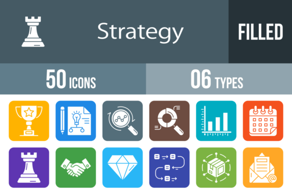
In the world of modern design, visual shorthand is everything. We often spend too much time explaining complex business concepts through text when a single, well-crafted image can do the heavy lifting. That is exactly why I was drawn to this collection of 50 Strategy Filled Round Icons. At first glance, they might look like standard vector graphics, but looking closer reveals a design philosophy built on clarity and usability. These aren't just decorative flourishes; they are functional tools intended to bridge the gap between abstract strategy and concrete visual communication.
The visual personality of this set is distinctly professional yet approachable. Because they are designed using a unigrid system, there is a rhythmic consistency to them. Whether you are looking at the Chess piece, the SWOT analysis icon, or the Rocket Launch, they share the same optical weight and structural integrity. This "filled round" style is particularly effective in digital environments. The solid shapes ensure high contrast against both light and dark backgrounds, which solves a common headache in responsive web design. When you shrink these down to 16x16 pixels for a mobile footer or blow them up for a presentation slide, the integrity of the shape remains intact. It is this versatility that elevates them from simple graphics to premium design assets.
Practical Applications for Designers and Brand Strategists
For anyone involved in brand identity or editorial design, consistency is the currency of trust. If you are building a visual language for a startup or a corporate rebrand, you need iconography that speaks the same dialect as your typography. These 50 Strategy Filled Round Icons are particularly useful here because of their neutrality. They don't lean too heavily into a specific trend that might date the design in six months.
Consider the context of a pitch deck. You have your font pairing set—a strong sans serif for headlines and a legible serif for body copy—but the slides feel text-heavy. Dropping in the Bar Chart, Pie Chart, or Line Graph icons instantly breaks up the monotony. They provide a visual anchor for the viewer's eye. Similarly, for packaging design or social media graphics, icons like Achievement, Victory, and Trophy offer immediate emotional cues. You don't need to explain that a product is a winner; the iconography tells that story before the user reads a single word.
Here is where I find them most effective in real-world scenarios:
- Dashboards and UI Design: The Analytics, Seo Report, and Workflow icons are perfect for SaaS applications. They guide the user through complex data structures without overwhelming them.
- Infographics: When creating long-form content about business growth, using the Ladder, Growth, and Milestone icons helps to visualize the journey from concept to success.
- Corporate Training: For internal presentations, icons like Agenda, Skills, and Pyramids of Needs can clarify training modules and organizational charts.
Maintaining Visual Hierarchy and Professionalism
One of the most overlooked aspects of web design and logo design is the management of visual weight. A common mistake is mixing line art with filled icons, which creates a discordant, messy look. Because this entire set is "filled," it offers a uniform density that anchors your layout. When you place the Target icon next to a headline, it doesn't disappear into the background noise; it holds its ground.
From a technical standpoint, the availability of 6 different formats (AI, CDR, EPS, JPG, PNG, SVG) is a massive time-saver for creative professionals. We have all been there—stuck with a low-res JPG when we need a vector for print. With 50 Strategy Filled Round Icons, the workflow is seamless. If you are designing a physical brochure, the vector formats ensure crisp edges at any scale. If you are optimizing a website, the SVG format allows for smaller file sizes and faster load times without sacrificing quality. This flexibility is non-negotiable in today's multi-platform publishing environment.
Selecting the Right Visuals for Your Project
Choosing the right icon is less about what looks "cool" and more about what communicates "fast." When evaluating these assets for your next project, look for conceptual alignment. For instance, if you are writing a blog post about overcoming obstacles, the Maze or Red Flag icons are far more evocative than a generic checkmark. If your focus is on networking and expansion, the Network and Distribution visuals provide that specific context.
It is also worth noting how these icons interact with different typefaces. If you are using a heavy, geometric sans serif font, the roundness of these icons provides a nice softening contrast. Conversely, if your design relies on a delicate script font or a handwritten font, the solid geometry of the icons can provide much-needed structure and stability to the layout.
Ultimately, 50 Strategy Filled Round Icons are about reducing cognitive load for your audience. In a world saturated with information, the ability to say "this is about planning" (using the Planning icon) or "this is a launch phase" (using the Rocket Launch icon) instantly allows your reader to categorize and understand your content. By integrating these 100% vector assets into your toolkit, you aren't just decorating a page; you are refining your message and ensuring your visual hierarchy is as sharp as your strategy.