50 Approved and Rejected Icons: A Complete Visual System for Clear Communication
Why a Dedicated Set of Status Icons Changes Everything
You know that moment when a user completes a checkout, submits a form, or finishes an onboarding step, and the screen just... sits there? No confirmation. No rejection notice. Just ambiguity. That gap between action and feedback is where trust erodes. The 50 Approved and Rejected Icons set exists to close that gap with visual clarity that feels native to your product.
This isn't a scattered collection of random checkmarks and X marks pulled from different sources. Every icon in this set was designed on a unigrid system, meaning each one shares consistent stroke weights, optical alignment, corner radii, and proportional relationships. When you place the Document Approved icon next to Document Rejected, they look like they belong together — because they were built together. That kind of internal consistency is surprisingly rare in icon libraries, and it makes a real difference when you're building interfaces, dashboards, or print materials where dozens of icons appear side by side.
Understanding What's Inside the Collection
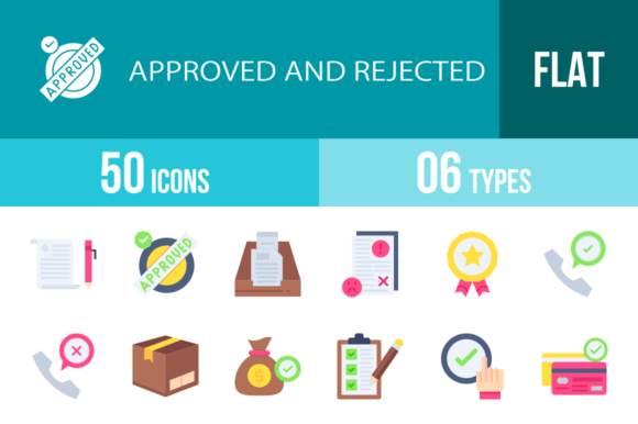
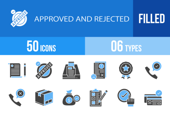
The set covers 50 distinct icons split across approval and rejection states, with filled blue and black variants for each. You get recognizable status symbols like Approved, Rejected, Checkmark, and Thumbs Up alongside more specific scenarios: Credit Card Approved, Face Recognition Rejected, Delivery Box Rejected, Speech Bubble Approved, and USB among others. The range means you're not stuck trying to force a generic checkmark into a context where a Stamp Rejected or Password Approved icon would communicate far more precisely.
Each icon ships in six formats: AI, CDR, EPS, JPG, PNG, and SVG. That covers virtually every workflow — vector editing in Illustrator or CorelDRAW, web development with SVGs, quick placement in presentations or documents with JPG and PNG, and print-ready production with EPS files. The 100% vector construction means you can scale any icon from a 16px favicon to a billboard without losing sharpness.
Where These Icons Actually Earn Their Keep
Think about the projects where status communication matters most. In mobile app design, you need instant visual feedback for payment confirmations, account verifications, and error states. The Mobile Check, Password Rejected, and Face Recognition Approved icons were clearly designed with touch interfaces in mind — bold enough to read at small sizes, distinct enough to differentiate approval from rejection at a glance.
For web design and dashboard interfaces, icons like Laptop Approved, Product Approved, and Mail work beautifully in navigation bars, notification systems, and status indicators. The filled blue and black variants give you flexibility: use blue for interactive or highlighted states, black for neutral or secondary placements. This kind of thoughtful color treatment aligns with how modern typeface and icon systems handle weight and emphasis.
Print and editorial design benefit too. If you're producing reports, infographics, or packaging design materials where you need to indicate compliance, approval stages, or quality checks, icons like Checklist, Shield, Policy, and Badge add professional visual shorthand without requiring lengthy explanations. Presentation designers will find the Agreement, Hired, and Procedure icons particularly useful for slide decks where visual hierarchy and quick comprehension drive engagement.
How Consistent Icon Systems Shape Brand Perception
Here's something that doesn't get discussed enough: your icon choices communicate brand personality just as much as your logo design or color palette. A scattered mix of icon styles — some rounded, some sharp, some thin, some bold — signals carelessness. A unified system like the 50 Approved and Rejected Icons set signals professionalism and intentionality.
When a user sees the Thumbs Down icon next to Bad Feedback and then encounters Good Feedback with Thumbs Up, the visual language feels coherent. That coherence builds recognition. Over time, your audience starts associating specific icon shapes with specific meanings within your product or brand ecosystem. That's the foundation of strong brand identity — not just what things look like, but how consistently they communicate.
The unigrid system also supports visual hierarchy. Because every icon shares the same underlying grid, you can place them in lists, tables, or feature comparisons without worrying about misalignment or visual weight imbalances. The Agreement icon won't dwarf the Delete icon. The Slider Tool won't feel out of place next to Post Terminal. That kind of visual democracy makes layout work faster and cleaner.
Practical Guidance for Working With This Set
Start by identifying which icons map to your actual user flows. You probably don't need all 50 in every project. If you're building an e-commerce app, the Credit Card Approved, Credit Card Rejected, Remove From The Cart, and Delivery Box Rejected icons will see daily use. If you're designing HR or recruitment materials, Hired, Document Approved, and Call Rejected are your workhorses.
Test the icons at the actual sizes they'll appear. An icon that looks perfect at 64px might lose legibility at 20px. The SVG format is your friend here — you can adjust stroke weights or simplify details for smaller renderings while keeping the master file intact. For social media graphics and templates, the PNG files with transparent backgrounds drop into tools like Canva or Figma without extra preparation.
Consider how the blue and black filled variants interact with your existing design assets. Blue fills tend to read as positive, active, or informational — pair them with your primary brand color. Black fills work as neutral defaults or high-contrast options for dark mode interfaces. Having both available means you're not forced into a single color story.
For commercial use, review the licensing terms to confirm coverage for your specific applications — client work, product packaging, digital products, and merchandise typically require different permission levels. The investment in a properly licensed, cohesive icon system pays for itself in the time you save hunting for mismatched alternatives and the consistency it brings to your final output.
The Real Value of Purpose-Built Visual Communication
Generic icon sets serve a baseline purpose. But when your project demands clear, immediate communication of approval and rejection states — whether that's in a fintech dashboard, a healthcare portal, an e-commerce checkout, or a printed compliance report — a purpose-built system like the 50 Approved and Rejected Icons collection eliminates guesswork. Every icon was designed for a specific communication job, tested for maximum usability across devices and platforms, and delivered in formats that fit real workflows rather than hypothetical ones.
That's the difference between decorative icons and functional design assets. One fills space. The other solves problems.